
Designing Book Covers
- Marie Mullany
- Jul 13, 2025
- 3 min read

This is a story of designing book covers and what I've learned in the past four years.

When I first completed Hidden Blade, I was under the illusion that it was cool to put a scene from the book on the cover. So that first blue cover is Louis (the red head) and Falk (the blond), who are fighting against some assassins in this picture. Falk is using his magic to create multiple swords and defend himself against income strikes. Louis has the hats as shadows in his cloak because he uses hats to change personalities.
That cover didn't work despite being drawn by a reputable artist and everything. €400 spent.
Okay. I'm brave. I could try again. I went back to the artist and requested a more symbolic cover. I came up with the idea of a figure made of water carrying a girl made of water with the castle reflected in the background. This was symbolic of Louis rescuing Isabella.
Despite the art being pretty expensive, this cover didn't really work either :P (I'm sure you can see a pattern). €600 spent.
At this point, I switched from artists to graphic designers on grounds of cost. All the other red book covers have covers that were created by Liam Knoop, a graphic designer:

These covers didn't exactly set the world alight, but they didn't break the bank either (around €80 per cover) and each one symbolized something about Louis and Isabella.
Then in 2025, I met, and made friends with, an actual book marketing person. And she suggested completely redoing the covers, making them both symbolic and in keeping with epic fantasy. She made mock ups and I found a new artist.
The first round was a bit rocky, because the art was a bit too comic book style. Fortunately, Liz knows how to use photoshop and this is where I learned you need both graphic designer and artist.
For example: This was Keeper's art:
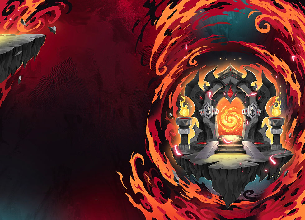
Created by the awesome Feby Hermawan (https://www.fiverr.com/febyhermawan)
That was great, but my marketing friend said: too much comic book and my heart sank. Had I tossed more money down the drain? But no, apparently it just needed some TLC. In this day and age, all art, even drawn by an artist, comes in layers. Here is just the gate extracted from the other layers.

And even that image has layers, those little decorations are layers, the arch is a layer etc. etc. Heck, there are layers that are nothing but a faint shade of red to make the flames redder. So, my marketing friend said no stress, graphic design to the rescue. A new background was added and the gate was made a little thinner and straighter. And of course, the typography was added:

Typography is a thing all by itself as well. The colors, the font, the placement, it is all geared toward making the cover as attractive as possible, along with setting the right tone. My books are epic fantasy and so the covers should feel like epic fantasy to the readers.
All told, the new covers cost me €250 per cover. So, ultimately cheaper than my original covers for Hidden Blade. If I'd bought these covers from the start, the books would have earned back the costs of their covers already.
So, what have I learned?
First, I'm not competent to design my own covers. Covers are marketing and I know nothing about marketing. Make sure you either know something about marketing or use a marketing expert for cover design.
Second, good art is not enough. You need good art, but artists are not good at layout or typography. You're going to need a graphic designer or graphic design skills for the layout and the typography (the title and author name and so on) .
Third, good layout is not enough, you're going to need swanky art too. Make sure the art is in layers so the graphic designer can work with each element. Also, don't go for super expensive artists, unless you're certain you're going to sell well over a thousand copies. Having great art is nice, but every cent spent on the cover is a cent the book needs to earn before you can even begin to turn a profit.
Fourth, try to design your covers with the series in mind. Having to re-launch a series is expensive.
And that's my story of book covers! Hopefully I can go forward in the future with just one iteration of a cover per book. And hopefully you can learn from my mistakes.


Comments